Wednesday, May 25, 2011

American Apparel Neon Purple

Here's the last of the American Apparel Neons I got. Neon Purple. It's a rich looking bright purple semi-jelly that dries a little matte.

The formula in this bottle is by far the best of the 3 I tried. It is a tiny bit thick, but goes on smoothly, not gunky in any way. This thickness made it the only one that I would actually consider a one-coat formula... although I did 2. It applies great, and has a matte-ish finish. I topped them with Seche Vite to get the glossy look.
The color is really rich and bright, it's not necessarily "neon" but it is HELLA bright. It isn't really a pure purple either. As with the Neon Red, it is more pink than the name suggests. This purple reminds me of those purple orchid lei's that people wear at graduation.


I don't know if I would wear this color often... maybe this color is better suited for Summer as opposed to Spring. It is reallllllly pretty, and wears like a dream; but I don't think it looks good on me... or with the colors I've been wearing this season. It is probably a knock out on lighter skin. I definitely recommend it though.

Friday, May 20, 2011

Mo Money, Mo Polish


Graduation Mani... Green and Gold

Took grad photos this week. I wanted to have a kind of cute mani that matched my school colors which are green and gold. For this I did 2 coats of "Here today... Aragon tomorrow" by OPI and another coat of "Boom Boom Pow" by Deborah Lippmann. Covered it with Seche Vite top coat. Its pretty easy. I got a lot of good comments from people who didn't realize it was 2 separate polishes, so that was cool.
"Here today... Aragon tomorrow" from OPIs Espana collection is a nice, dark green cream with a hint of shimmer. It goes on a bit uneven, so try and even it out, because if you paint on too many coats it will become so dark you lose the green color. "Boom Boom Pow" is Deborah Lippman's version of Gold; it contains 24 Karat gold dust, gold micro-glitter and gold hexagonal sequins. It's pretty ridiculous. I did a really light coat of this over the green just to get a taste of gold, and it still came out really gold, so you do not need to use a heavy hand with this.
Check it out, hope you like :)

Monday, May 16, 2011

American Apparel Neon Green

American Apparel Neon Green... or as I like to call it... Kermit. Packaging here, as with the Neon Red, is a new deco NEON logo in white, with a white cap... but still the same square bottle. Comes with the typical long AA brush. It's a cute change up from the original design, but in my personal opinion, the original promo shots for this line using the original design were cuter. But, no complaints, its just a bottle.

This is some bright ish, fo real! My nails look electric right now. This is an insanely neon color, that goes on really nicely. Incredibly smooth, albeit thick formula. Its thicker than the formula in Neon Red; it did that thing where the fluid won't separate from what's in the bottle, not good when it is brand new. It may need some thinner in a few months. Nice and opaque, no visible nail line with this color. It dries a bit matte, so I went over it with Seche Vite, that gives them the nice shine. All together, impressive color choice from AA. That's what I love about them, they are making bold color choices that are really practical to add to a collection, at least to us California girls... I don't know how Neon Green plays in other parts of the country. But, ya, I really like it. It was surprising to see it sit well with my darker olive toned skin. It really popped against my warm skin color. It's a recommend from me :)


Tuesday, May 10, 2011

American Apparel Neon Red

Here's my first review/swatches from the American Apparel NEON collection; Neon Red. I don't know that I would call this color Neon Red, it goes on as a mix between hot pink and orange, but it rocks, so no complaining here. This set of colors got a new treatment when it comes to packaging. The bottles are the same AA shape, but now come with White caps and NEON scrawled across the front in a sort of Deco font.


The color in the bottle looks VERY pink, but on the nails it is more orangey, maybe even red-orange, although I hesitate to call it that. The color goes on very opaque for a Neon polish, but because it is very jelly like, you can still get some visible nail line. I read online that putting White underneath would make these pop more, so I did a white coat underneath my ring finger. As you can see in the pictures, it made BARELY any difference. The notable difference is no VNL, it does pop a tiny bit more but that is only to the naked eye and when you are REALLY looking for it. I didn't like how this came out because I used OPI Alpine Snow, which was super runny, so I couldn't get a smooth layer beneath the Neon Red. Basically if you prefer a creamier look then you can do this but make sure you have an even coat of White underneath, and try to keep it thin because AA make there polishes a bit thick. If you like that jelly finish, then just stick to what's in the bottle. I did 2 coats on all nails, but maybe a third coat would also hide VNL.


The formula was a little thick, not as thick as previous AA offerings. A few other blogs are calling it a "one coat formula" but I never do one coat of AA, especially not this one which is a tiny bit sheer. It went on smooth and bubble free. Its a real punch to the eyes, it's SUPER bright which I love! The brush is long and thin, which I find harder to use then, for example, OPIs brushes; but it does the trick and gets the formula on smooth. All in all, I loved it. I found it really unique and playful. It looks really great paired with a white dress or white tshirt, or some silver jewelry. Very cute.

Saturday, May 7, 2011

Cinderella Nails :)

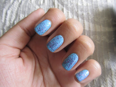
I was feeling flirty and in the spring-time mood, so I did a REALLY quick, adorable mani. It's just OPI's "What's With the Cat-ittude?" and Sinful Colors "Frenzy". 2-3 coats OPI and a coat of SC with Seche Vite Top Coat.
A little review; "What's With the Cat-ittude?" is an easy to apply, pretty, opaque, cream, sky blue... or Cinderella's dress blue. It was from the OPI Shrek collection, but isn't one that is still being continued, so if you see it, I'd say get it while you can. Sinful Colors is a drugstore brand, I see "Frenzy" in stock at practically every Target I visit. It's a pretty clear base with round purple and blue glitter. This glitter is CLEARLY meant to top other polishes, not be the base like many of the new glitters have gotten us accustomed to.
I've also used frenzy on top of white, yellow, and light purple. The first 2 were really cute, but over purple it strangely was too much purple. It just was not cute.
I'm not a big Cinderella fan, but someone grabbed my hands yesterday and called them that, and I realized that is exactly what this reminded me of. So I'm calling em Cinderella nails lol.

Wednesday, May 4, 2011

MAC Mischievous Mint

I LOVE the cute candy colored pastels that arrived in the MAC Quite Cute collection. The
offerings are a cream pastel pink called "Ice Cream Cake", a cream light lavender called "Little Girl Type", and this minty cream "Mischievous Mint". They aren't very unique, but I love MAC and figured I'd pick one up.


As soon as I opened this I was NOT happy. Unfortunately, the brushes are either different, or reacting to the formula in a weird way. The brush was weird and frayed. This led to a lot of bubbles in the application. If you look at my photo you can see bubbles in the bottle, I don't know what it is but, it added to the bubblyness. So basically, I had a really wonky application with this. The formula is Thick and Runny at the same time, I don't know how that is possible. Because of the frayed brush, layers would not go on completely, it was just a mess. You can kind of see how thick the color looks on my nails. That is 3 coats, which is a lot, but I had to do 3 to get color on all parts of my nails. Maybe it needs some rolling beforehand, which I didn't do. The color is really very pretty and perfect for spring, but if I can't get it to look nice on my nails, what's the point? Especially at $14, you would expect better quality. This color is a dead on dupe with Revlon's Minted which is only $4 at drugstores and American Apparel's Office which runs $6. It's also very similar to China Glaze's Refresh Mint, China Glaze's For Audrey, OPI's Mermaid Tears, and many other cheaper/ better alternatives.

Standard MAC packaging

This is the color at it's richest in warm indoor lighting

I couldn't get the Macro setting on my camera to work, if you have good eyes you'll probably notice how frayed the brush is. Just, poor quality.